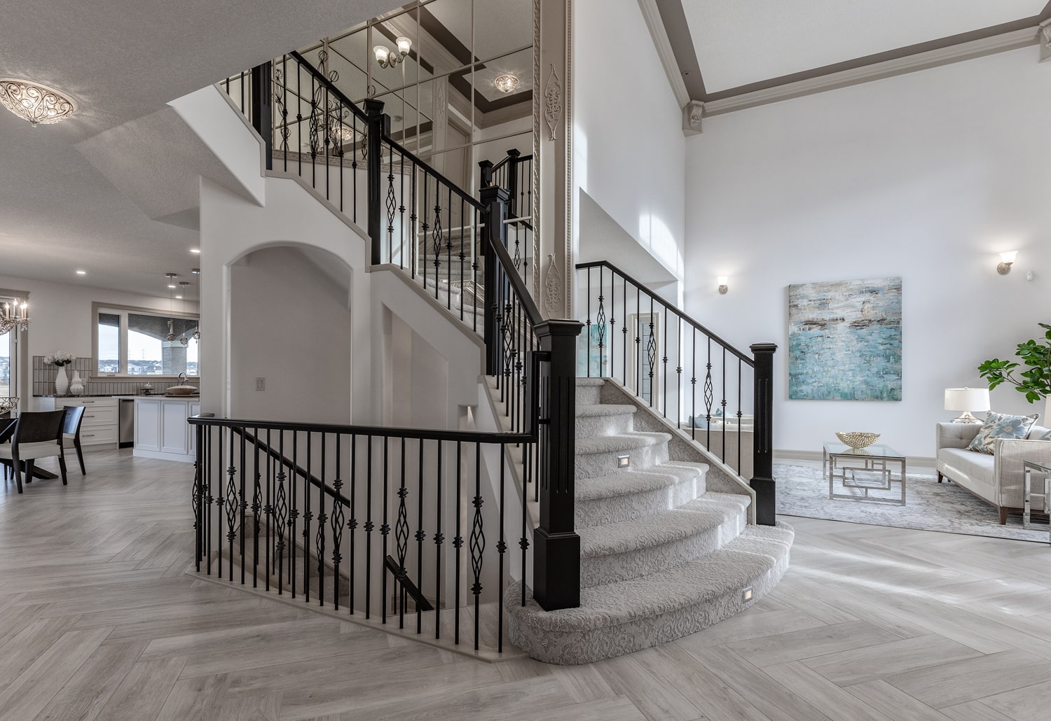
If you’ve decided to update your main rooms with fresh paint, those areas that host family and friends like the living room, you’ve got plenty of stylish shades to choose from. Ones that run the gamut from bold statements to calming neutrals. The one you choose depends on several factors, including your taste, the colour of your furnishings and the kind of ambience you want to create in these rooms.
Are you an extrovert who thrives on colour? Do you prefer that your space is calm and soothing, a respite from a busy world? Whichever profile describes you best, as your interior designer will tell you, there are really no wrong answers. Your home, but particularly the main rooms on the first level, should reflect who you are and your style. Here are some of the most popular paint colours we’re seeing for spring and summer, 2021. Maybe one will strike your fancy and you’ll think, “Oh! I would love that colour in my living room!”
1) Neutrals are always a smart choice. That includes off white, beige, taupe and other shades that work with any furnishings. If you are considering selling in the not too distant future, neutral are the way to go. Potential buyers don’t want to come into a home and see black walls, usually, because they start adding in the cost of redecorating to the price of the house. Neutrals make a home move-in ready. Furthermore, they are beautiful and timeless.
2) Blues in all shades are extremely popular. Blue is North Americans’ favorite colour, so it’s no surprise we see plenty of folks choosing to paint their main rooms in it. Go bold with a deep navy and off set it with white or pale blue furnishings. Or put powder blue on the walls and navy on the trim. No matter how you use it in your main rooms, they will look smart and elegant, but be sure you let professionals do the painting. It isn’t as easy to paint large rooms and trim as you may think!
3) Green is nature’s colour. Ever noticed how many professional offices are painted in green? That’s because studies show that green, whether pale or deep, is a soothing colour that helps people relax. And green is particularly big this year, perhaps because folks are spending a lot of time indoors and want a little bit of nature surrounding them.
4) Grey, in all shades. Grey is a neutral when it’s pale, like a soft, dove grey. But when it’s darker, it becomes much bolder and can really make a statement. If your home is modern and sleek, grey and black are perfect choices for paint in the main rooms. If you want pops of colour, toss some cushions on the chairs in a vibrant hue and drape a throw across the back of the sofa in a rich burgundy. There are lots of ways to add in bursts of colour when your decor is in grey tones.
Whichever way your leaning when it comes to refreshing the main rooms, be sure to look carefully at the different tones and hues in the paint store’s colour wheel. Even the slightest difference makes a big change – off white or champagne or beige, for example. Look at them under good light, and consider all the decor elements in the rooms that are being redone. Once the painting is finished, all your main rooms will have brand new life and energy.